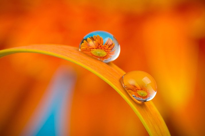
Do you really need to be an expert in color science to be a better photographer? Not really! But having some sort of idea about this will help improve your photography. As a professional photographer, you always have room for improvement. Knowing how the colors work will help you capture precise pictures.
But is that hard to figure out? Never. Beyond how we see and observe different colors, there are some classifications. There are some primary colors, like red, green, blue, and more. Also, there are groups that combine different colors.
In today’s blog, we’ll provide an overview of color in photography and explain how to use it effectively.
What Is Color?
To simplify, color is all about light and the visible spectrum. When we visualize, we see colors on different objects that reflect on our eyes. This happens due to the electromagnetic radiation from the lights out there when we visualize. Now you might be wondering how the human eye perceives colors, right?
Well. When light strikes an object, some wavelengths are absorbed while others are reflected. The reflected wavelengths reach our eyes, which we interpret as color. For example, a leaf appears green because it reflects green wavelengths and absorbs the rest.
Why RGB Is Used in Digital Photography?
There is a strong relation between what is known as RGB and photography. You will find expert and professional photographers make the most use of RGB and bring a more realistic vibes with their photography.
The main reason why RGB is used in digital photography is because this aligns with the screens and sensors of the camera. Now RGB light consists of the primary colors out there like red, green, blue and yellow.
Camera sensors are designed to capture light in red, green, and blue channels—just like the cones in our eyes. Each pixel on a camera’s sensor typically records brightness in one of these colors, which is then interpolated to form a full-color image.
Color Theory Basics
In order to go through effective photography, you should have some sort of idea on color theory. Then again, this doesn’t mean you need to be a pro at this. But the basic idea will always help you.
We can categorize the colors in several groups. Number one comes from the primary colors or the fundamental colors we often experience. These are red, blue, and yellow. There are secondary colors as well. To mention some of them, green, orange and purple comes at the top of the list.
If you think about the colors we’ve just mentioned, these are created combining two primary colors. There are tertiary colors as well. The type of color is created combining one primary color and one secondary color. For example, red-orange, blue-green.
Now do these make sense?
Photographers can create visually appealing images by using color harmonies. Complementary colors (like blue and orange) sit opposite each other on the wheel and create striking contrast.
Is There Any Emotional Impact of Color?
Yes, definitely. There are some emotional impacts of color out there. When it comes down to shaping emotion, colors are supposed to play a prominent role.
For example, red often conveys passion, urgency, or danger, making it ideal for dramatic compositions. Blue tends to evoke calmness, serenity, or sadness, often used in tranquil or reflective imagery. Yellow, on the other hand, brings a sense of warmth, happiness, and energy.
As a professional photographer, knowing these things will help you capture images in a meaningful way. At the end of the day, you need to let people think about your box and sometimes let them think out of the box.
What you really need to do is choose the right color pallets based on the emotional facts we mentioned. This way, you can effectively pursue storytelling at its best.
How Does Color in Composition Help the Professional Photographer?
You know what? The bright colors out there like red, yellow, white drive the attention of people the most. This also brings a more natural and muted tune. You can use the colors as a focal point to put more focus on the object.
Not only that,
Balancing colors in the frame is equally important. Too many competing hues can overwhelm the viewer, so it’s crucial to avoid color overload by limiting your palette or using subtle transitions. A well-balanced image allows colors to complement each other without distraction.
How to Make the Most of Color in Different Lighting Conditions?
Choosing the different colors in different lighting conditions is important for a professional photographer. And most importantly, different color schemes have an impact on the lighting conditions you tend to go with.
Now to bring in a scenario,
Golden hour light—shortly after sunrise or before sunset—adds warm, soft tones that enhance skin tones and create a magical atmosphere.
Look, I know some photographers who aren’t really worried about choosing colors when it comes to photography. And for this, they are often not able to bring the desired outcome.
Indoor lighting and artificial sources (like tungsten or fluorescent bulbs) can cast color tints—yellow, green, or blue—that may distort your scene’s natural look.
Common Mistakes to Avoid for Color Combination in Professional Photography
It’s easy to get carried away with editing, but over-saturating colors can make your photos look harsh and fake. Watch out for inconsistent white balance, too—it can throw off the mood and make shots feel disconnected. And always consider color harmony—clashing tones can quickly ruin an otherwise great image.
As a professional photographer, you have more to explore about colors. The learning should go on as this is directly linked to your task. You need to pay attention to how colors appear in art and nature. Observing the tasks of others will also help you understand the use of different color schemes in various scenarios.
Apart from that, you should experiment with different lighting conditions to see how colors shift, and always shoot in RAW so you have more control during editing and color correction.


